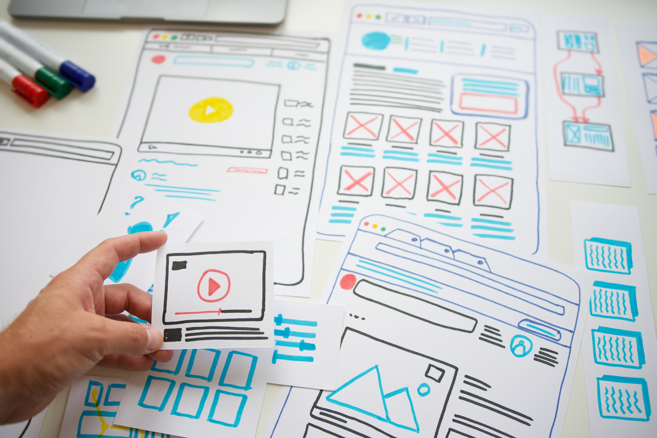
The homepage of your website is prime virtual space for your charitable organization.
The homepage receives the most amount of page views on a website, and most folks will visit a homepage at least once in their user journey to becoming a supporter. Consider that potential donors, volunteers and fundraisers will look to your website not just information about your mission, but also for credibility and to gain trust in what you do. To ensure you make the best impression with your donors, here are some guideline of elements to include on your website’s homepage.
1. Relevant content that gives an overview of the organization
Visitors will often visit the homepage to learn more about the organization and cause. It’s important to have a clearly written copy so users can quickly orient themselves, learn about who the organization is and what the organization does. For example, you may want to incorporate parts of the
brand message,
value proposition or
mission statement in the header area. Overall the content should successfully tell a high level story of the organization to its users.

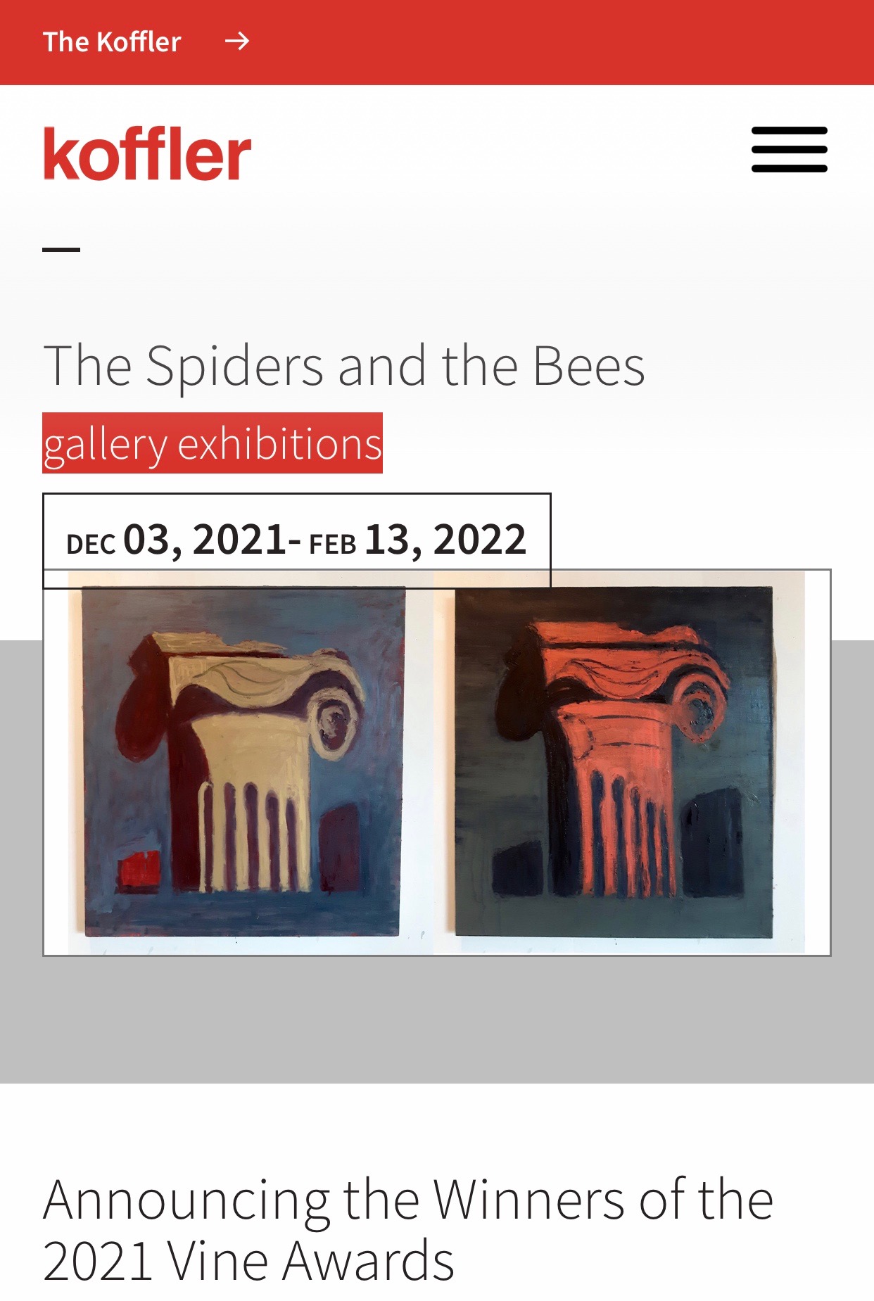
Kofflerarts.org, a site designed by AKA New media, states what the organization does and showcases the work they do in the sections of their homepage.
2. Logo and branding elements
A logo is a crucial element of your
brand identity that should be included on your website, as well as other marketing materials. Other branding elements can include everything from visuals to language, tone and voice. Branding is all about communicating the right message to your audience. Your branding should be consistently used across different mediums in order to appear professional, inspire confidence and let the user know they are at the right site.
3. Clear navigation
To decrease
bounce rate, users should have a clear path throughout the site in order to accomplish their goals. A clear navigation should show users their options and have user-centric sections and naming. 3-6 sections is ideal to avoid cognitive overload. You should also think about priorities for your users and priorities of the organization or business when designing the navigation. For example, you can hide links or pages that are less important to user goals in a hamburger menu, and only show a select few important links in the navigation bar. Think about the
hierarchical structure and how items can be placed to help users find what they’re looking for.


An example of a responsive website navigation on Kidney.ca, designed by AKA New Media.
4. Relevant call to action buttons
A primary goal of your homepage should be to influence users to further engage with your site and move them into the funnel to make a donation. Include relevant and clear
call-to-action buttons that are easy to find on the page and action-oriented to convert visitors into supporters. The most obvious, of course, is to clear call-to-action to
donate on a mobile-responsive and user-friendly form, but call-to-actions to
sign up to fundraise, subscription to your newsletter and/or more temporal buttons to register for upcoming events are all ways to drive visitors to become more involved with your cause.

Mobile-responsive donation form accepting one-time, recurring and tribute gifts to Lakeridge Health Foundation, built using raisin's Donations module.
5. Use a search bar to guide traffic
If users can’t find what they’re looking for from scanning the homepage, they’re likely to use the search bar to aid them. Ensure your search bar is at least 25 characters wide so that they can type multiple words and are still able to see parts of their search inquiry. A search bar can especially useful for deeper sites to guide traffic off of your homepage.

A large search bar on the homepage of Baycrest.org, a website designed by AKA New Media.
6. Meaningful graphics
Avoid showing models or stock photography, which doesn’t do a great job at conveying human connection. Imagery should feel genuine and be relevant to the content on the site.


Powerful imagery from Hotdocs.ca, a website designed by AKA New Media.
7. Readable typography
It’s important to ensure the web fonts chosen for your site are legible. Consider choosing classic web-safe fonts that are available on Google fonts, as you can’t go wrong with these. The size of the font also impacts legibility so make fonts at least 16px. Online tools like
fontjoy.com can help you choose type combinations that pair well with one another.
8. Social proof elements
Social proof is the psychological phenomenon where people reference the behaviour of others to guide their own behaviour. Social proof can help new visitors gain trust about where their donation is going and the good their gift will have in the world. This includes elements like stories, testimonials, or reviews. Social proof can also help users feel a sense of human connection with your cause and who they are supporting -- now and on repeat visits to your site.

Social proof in the form of community stories on the homepage of Kidney.ca, a website designed by AKA New Media.
9. Link names that begin with the most important keyword
Users will be scanning the page to find the area that will help them reach their goal. The name of links should be a relevant keyword to make it easy for users to find them while scanning the page. This can also help the
SEO of your site.
10. Footer
A user may end up scanning the footer of a site if they are looking for important information they couldn’t find higher up on the page. This can include important links like contact information, address/map, email sign-ups and social media links.

A footer with useful links on the homepage of Baycrest.org, a website designed by AKA New Media.
By including these elements on the homepage, we want to help visitors learn more about the person or organization behind the site and help them accomplish their goals. Users have a certain set of expectations from what they’re used to from using other websites. There may be new trends every year, but the same crucial elements exist in order to ensure a great overall
user experience and to meet user expectations. Other optional elements you can include may depend on the type of organization the website is representing. This can include resources, links to new content or a news section to show the organization is active and involved in their industry.
Contact us if you’d like to learn more about how raisin and A.K.A. New Media's award-winning digital services can take your homepage design to the next level. We seek opportunities of social impact and maintain immense pride in all of the solutions and services we provide.